

Huong Viet - Brand and Menu Design
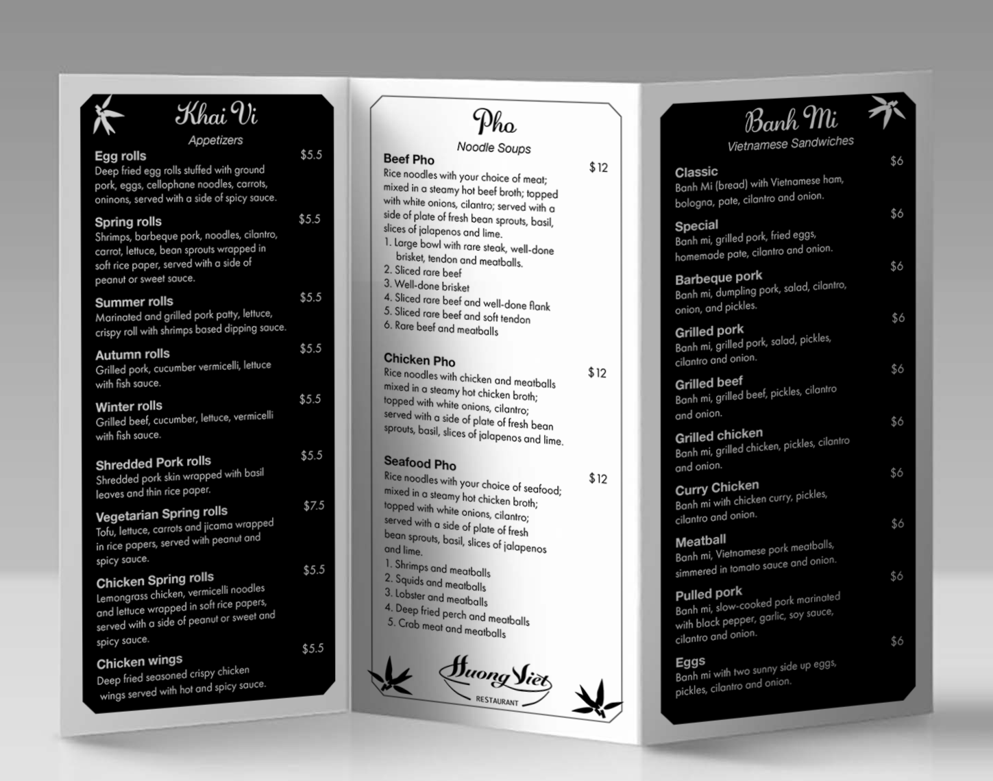
Huong Viet Restaurant is known for its authentic Vietnamese cuisine, especially its traditional Pho soups, fresh Banh Mi sandwiches, and flavorful appetizers made from fresh ingredients.
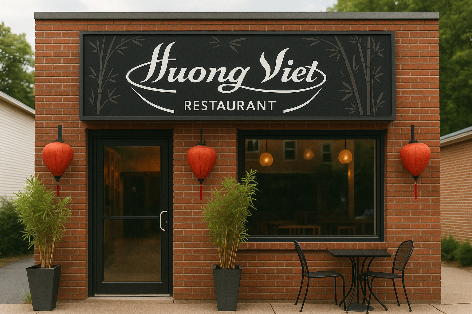
The client wanted to have a visually appealing, traditional, and readable restaurant menu. It includes logo in black and white, using only the expressive qualities of type and layout without relying on color.
Objectives
Solutions
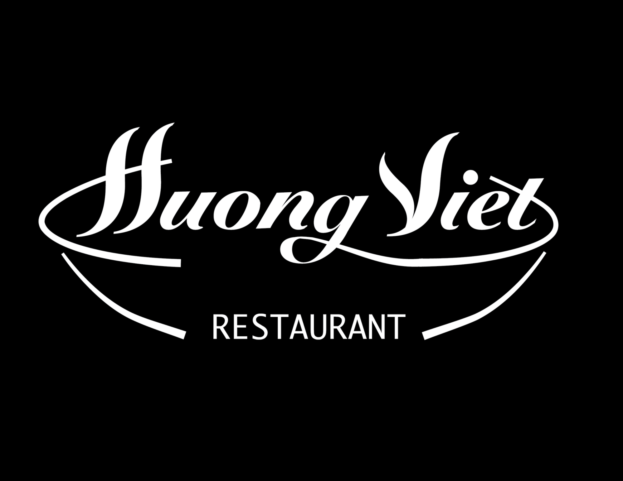
The logo uses flowing script typeface to convey Vietnamese elegance, warmth, and authenticity. The curved lines beneath the name forming the shape of a bowl of Pho.
The smooth, looping strokes suggest steam and the motion of noodles, adding a sense of freshness and comfort. The black-and-white color scheme as a main color palette.
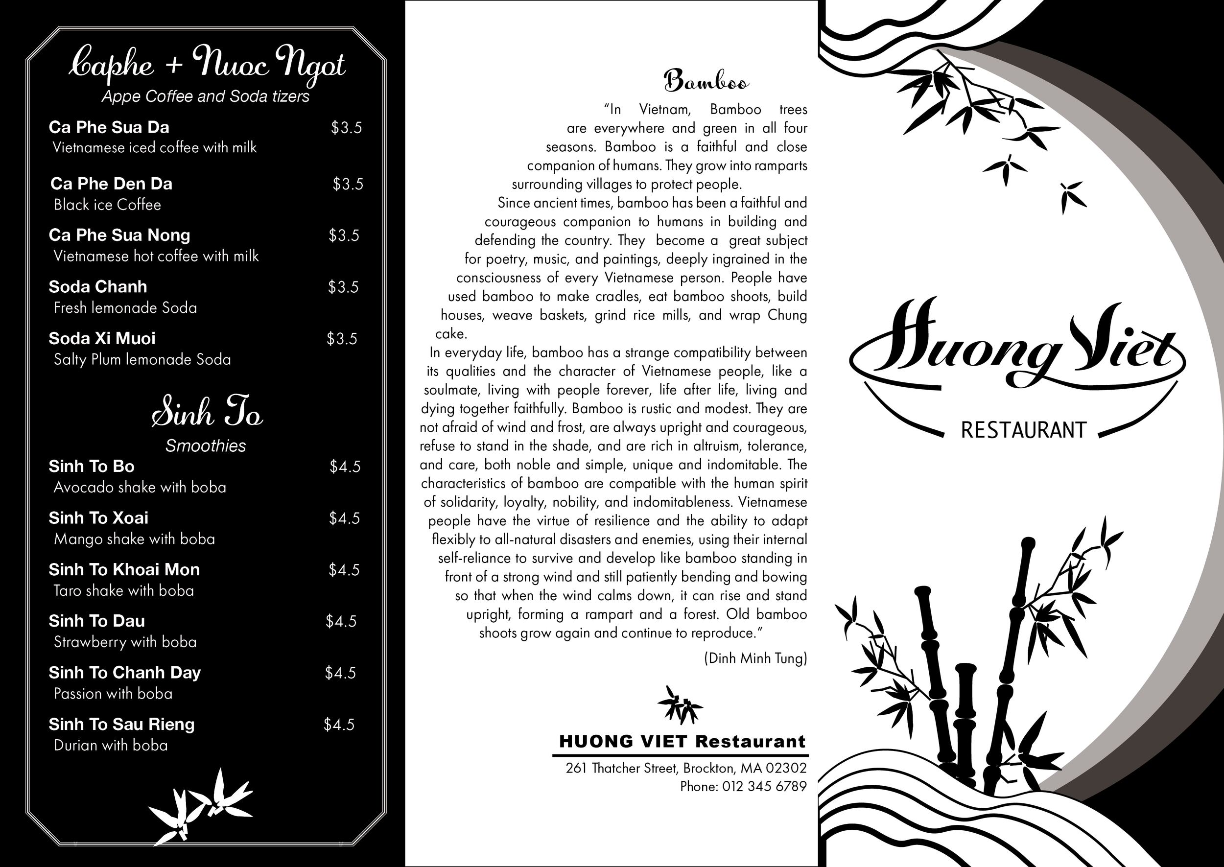
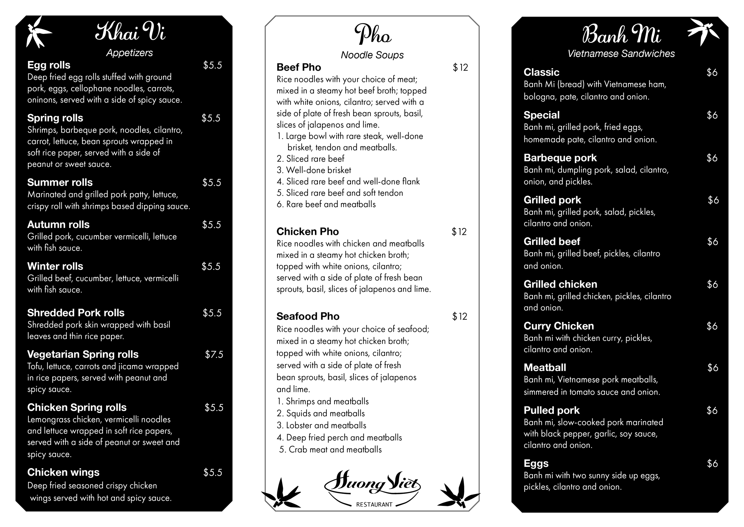
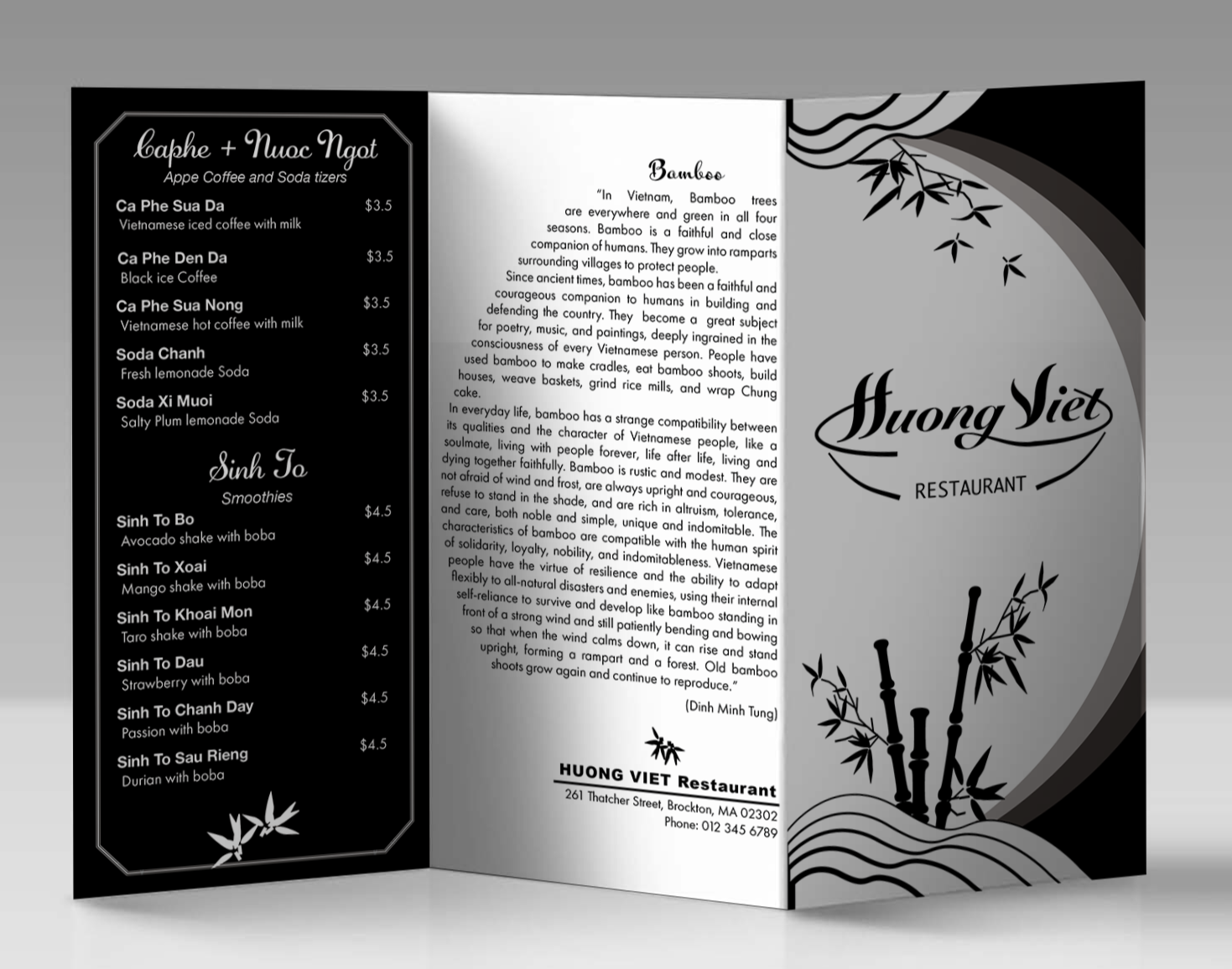
The design expresses Vietnamese culture through the graceful combination of typography and minimal graphic elements. Since the design was restricted to black and white, I focused on the contrast, spacing, and typographic hierarchy to guide the reader’s eye naturally through each section.
A clean serif typeface was chosen for the body text to enhance readability, while the display type adds a touch of cultural elegance and authenticity. The bamboo illustration and line accents were used sparingly to reflect Vietnamese tradition and to create a sense of calm and balance. Alignment and leading were carefully adjusted to maintain consistency and visual comfort across the multi-panel layout.
The result is a menu that feels both modern and traditional — a design that celebrates Vietnamese simplicity and sophistication through typography alone, proving that even in black and white, strong type design can communicate warmth, culture, and style.