Daisian - Font Design
Inspiration
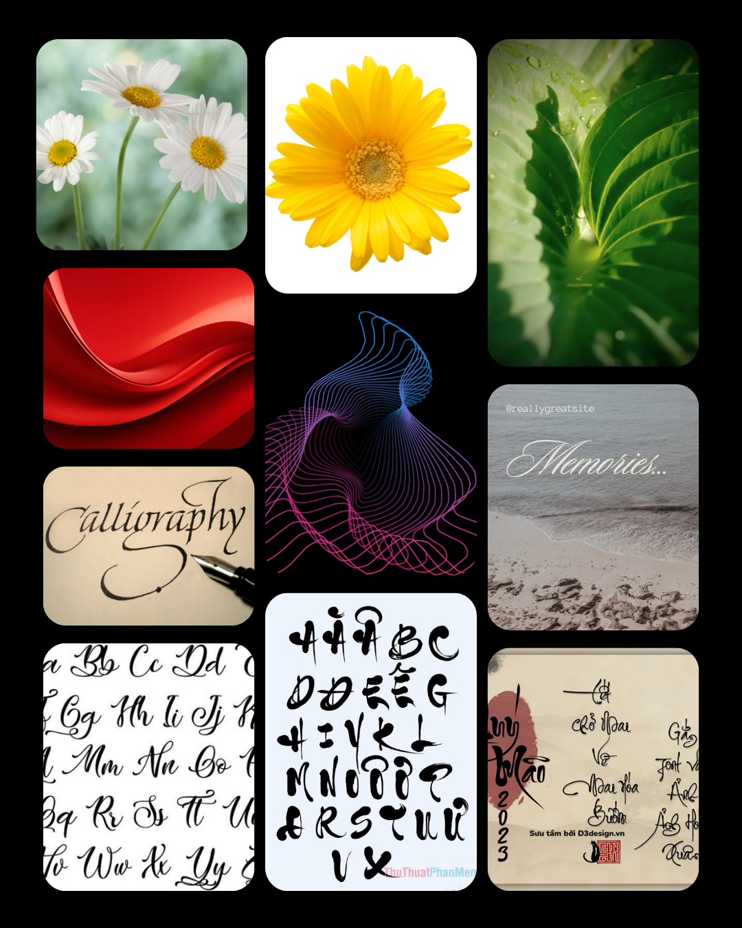
The overall inspiration for Daisian comes from a desire to combine natural softness with expressive, hand-drawn movement. I was drawn to the gentle, organic forms found in nature—shapes that feel delicate, curved, and flowing rather than rigid. At the same time, I wanted to bring in the emotional quality of handwritten calligraphy, where each stroke carries personality and feeling. The result is a typeface that balances grace and spontaneity, like a petal carried by a light breeze. Petalian is meant to feel alive, warm, and personal—inviting a sense of nature, memory, and quiet elegance through its form.
Key words:
flow - elegance - harmony - organic
Process
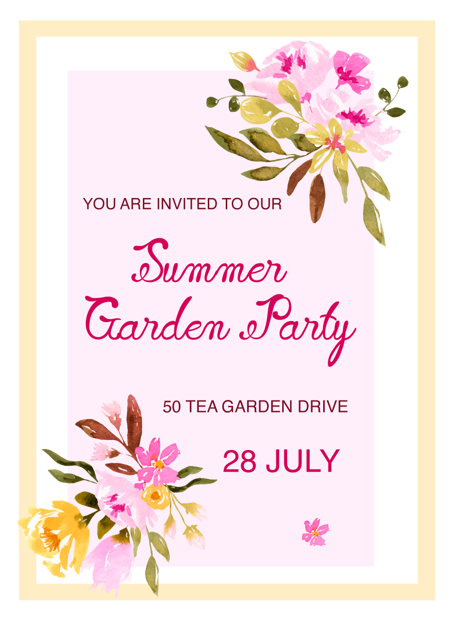
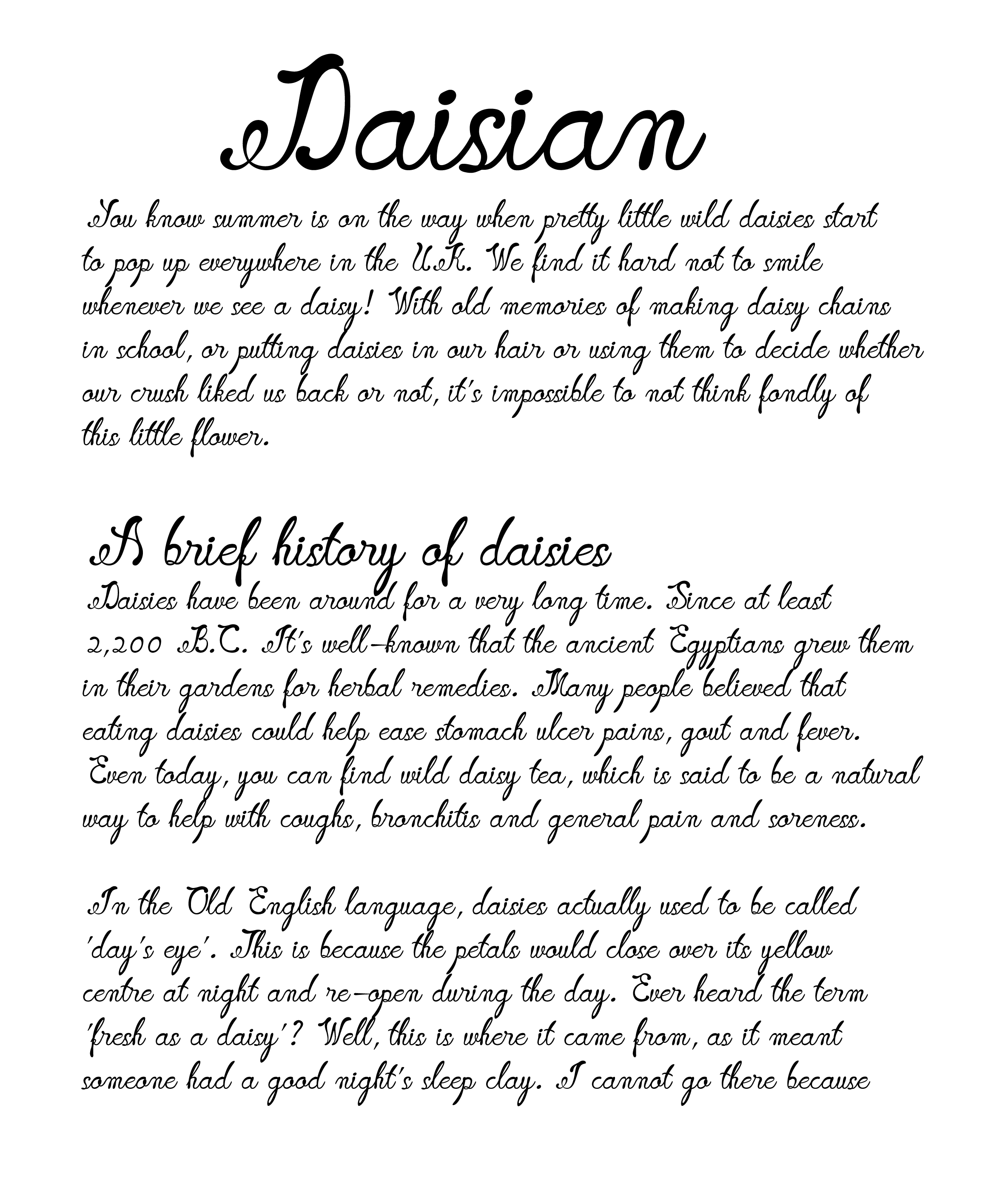
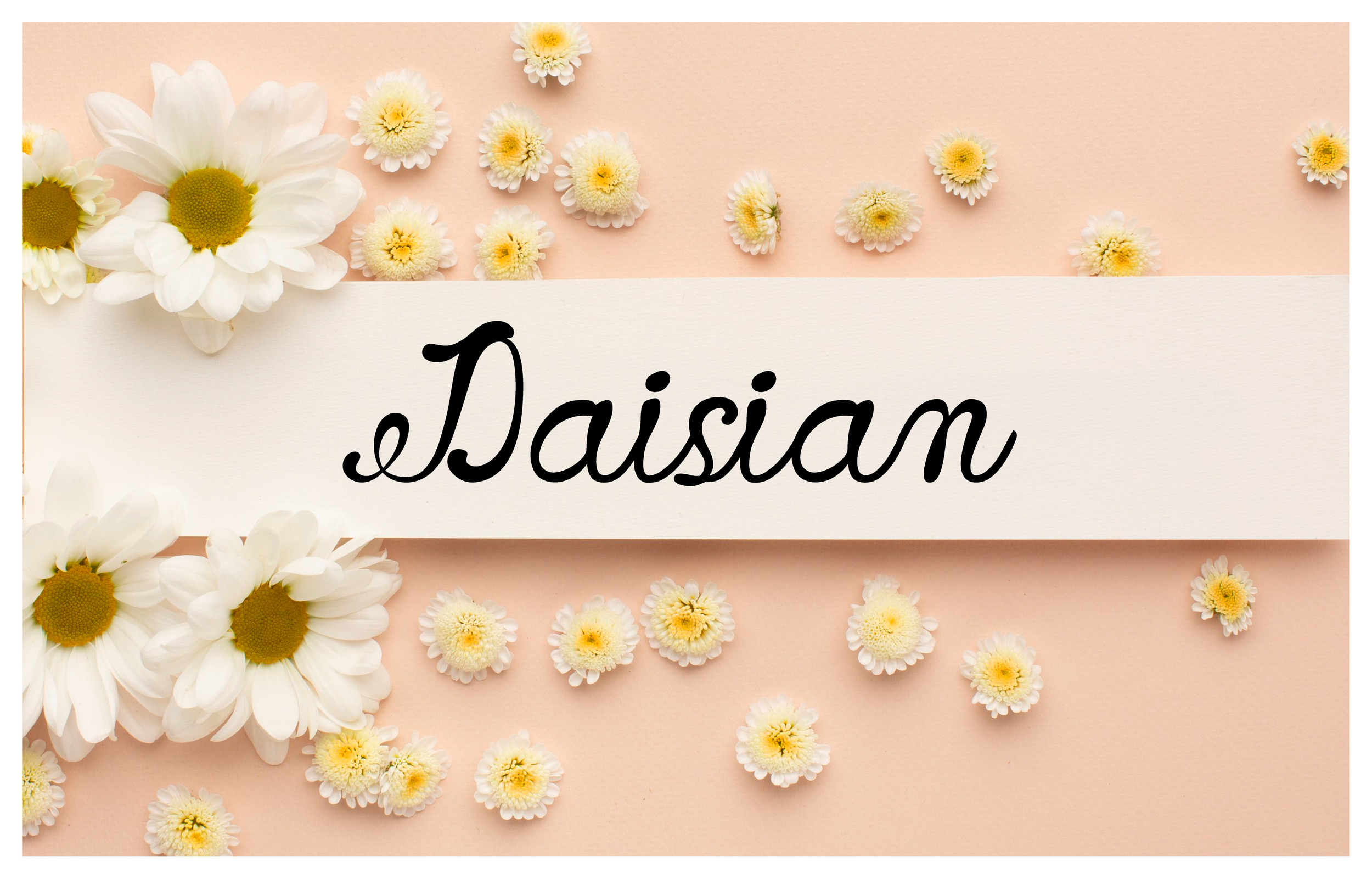
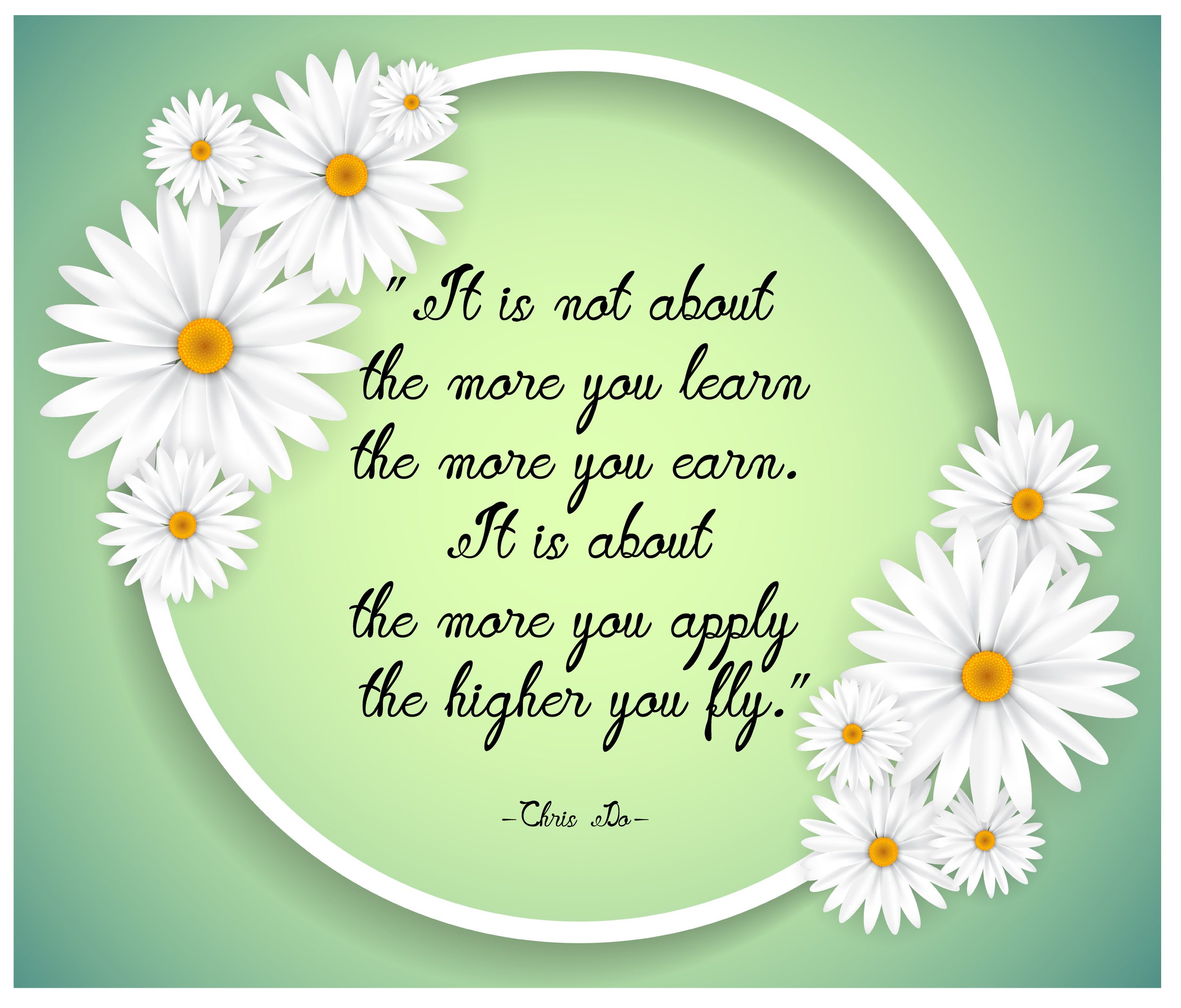
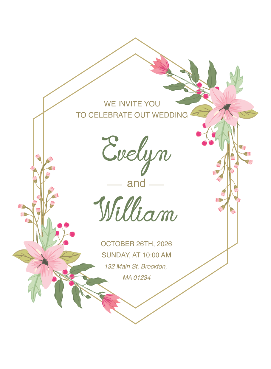
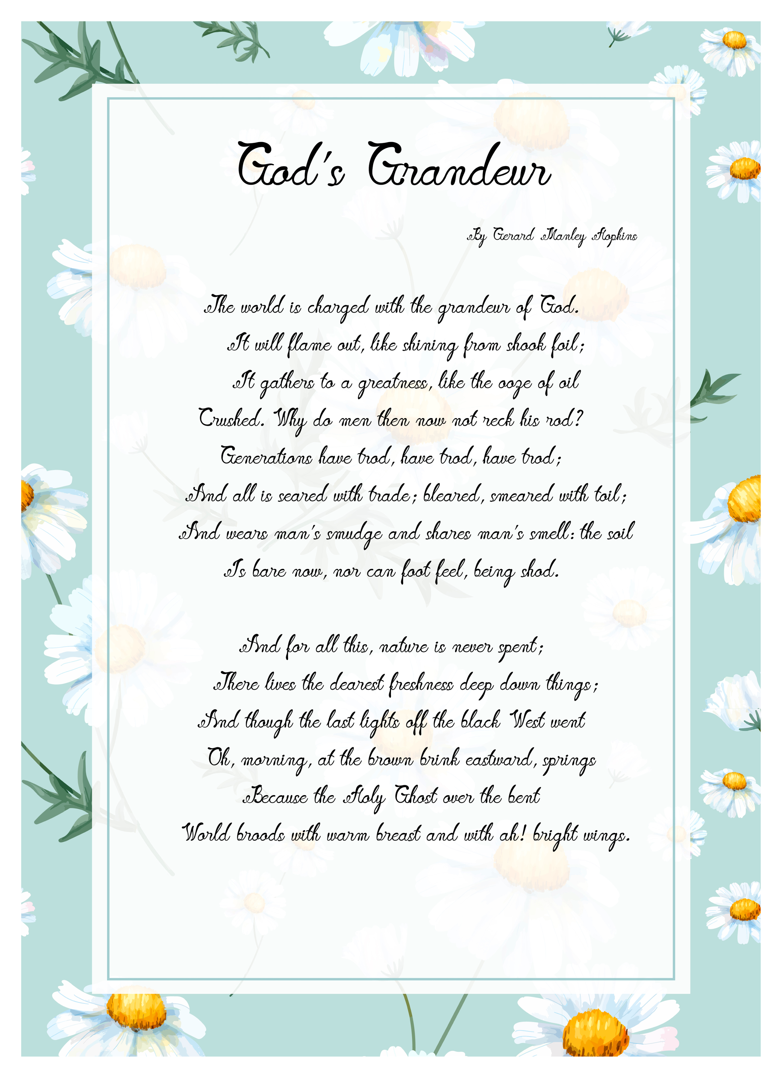
More Application
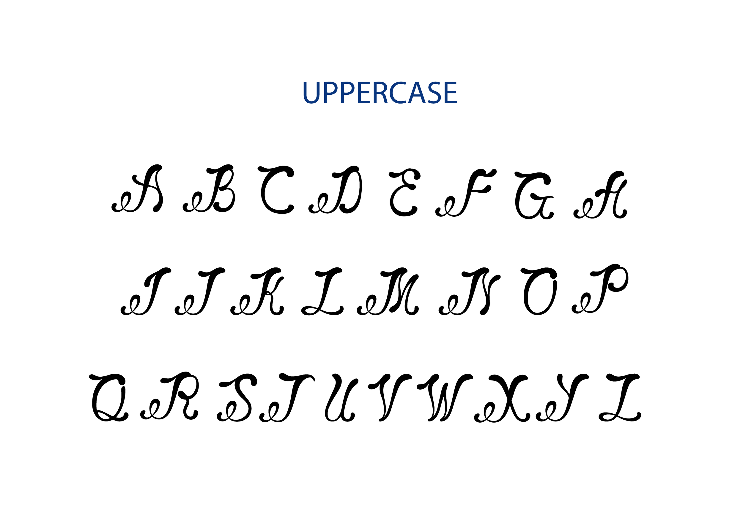
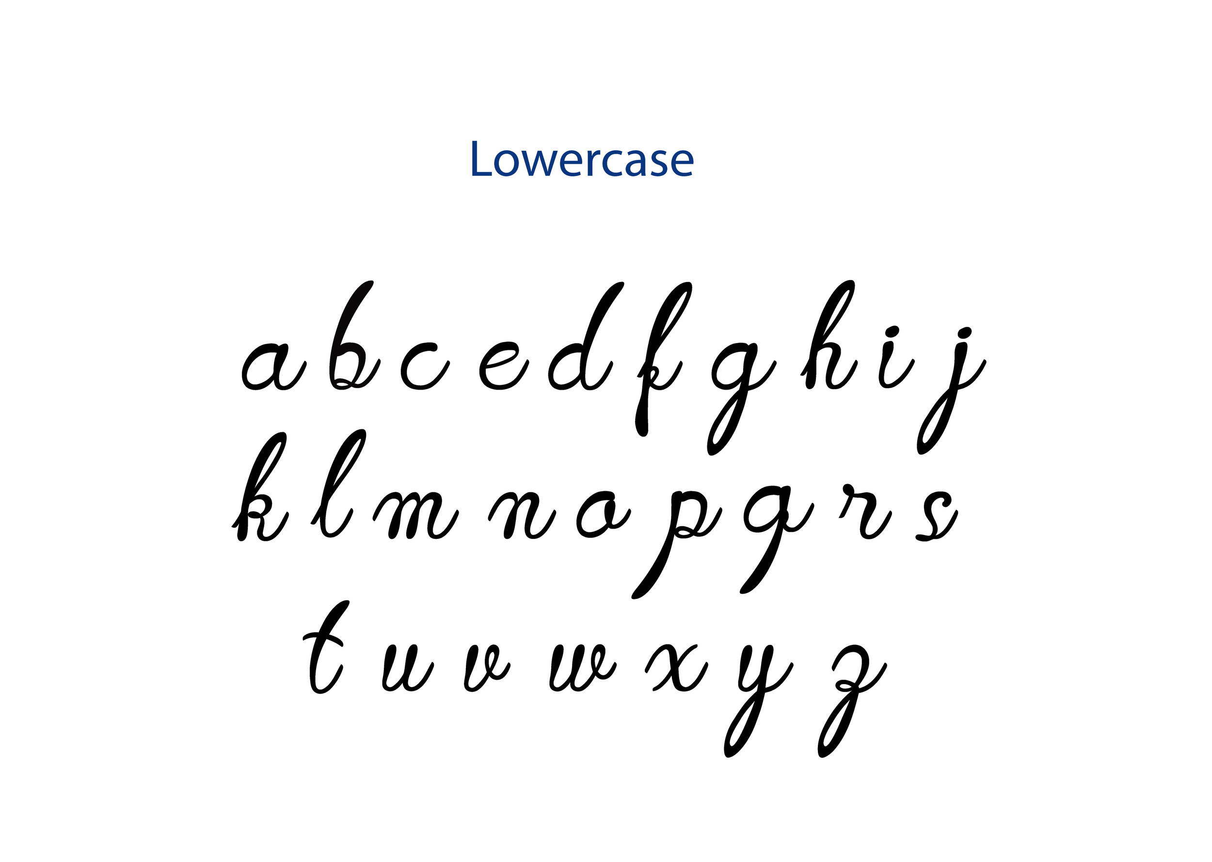
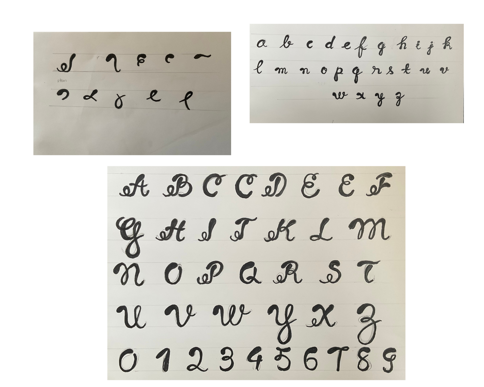
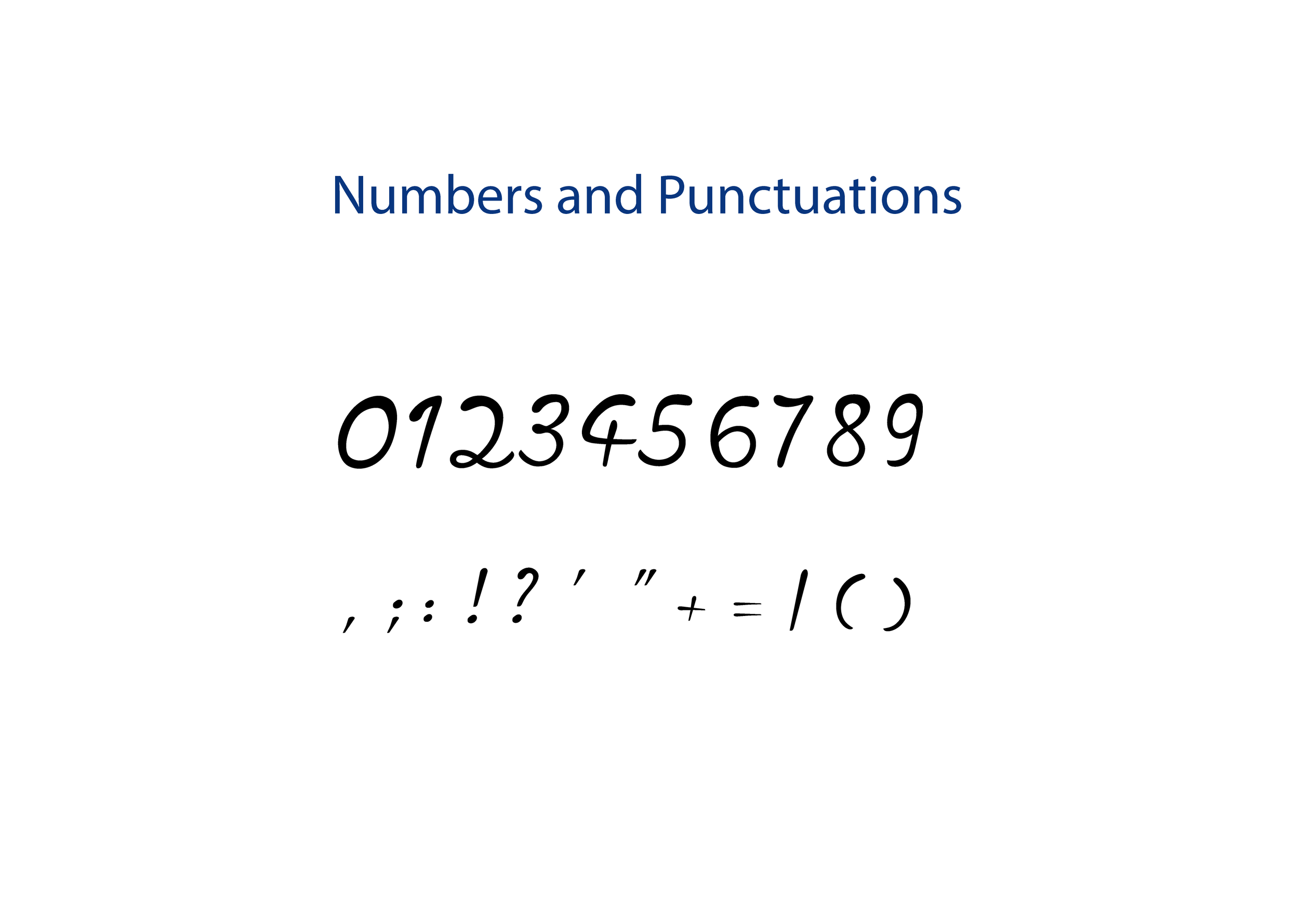
Experimented with petal-like loops and varying stroke weights to create rhythm and liveliness.
Starting with basic strokes inspired by flower petal curves. The focus was on creating smooth, flowing loops and balanced negative space. Adjusted to achieve consistent curvature ensuring each loop felt natural and connected.
Aligned each letter carefully to maintain even rhythm, baseline, cap height, x-height, and stroke contrast. The challenge was to balance expressiveness with readability.
Tested spacing and kerning between letter pairs to ensure harmony when words flow together. This helped the typeface feel cohesive and natural in text.