

PureSip Tea - Package Design
PureSip Tea Company was launching a new chamomile blend called Coastal Calm, inspired by the soothing essence of the ocean and the natural tranquility of coastal living. The company aims to explore different branding directions to determine how best to position this product in the market.
Three distinct design concepts that target a unique audience and mood:
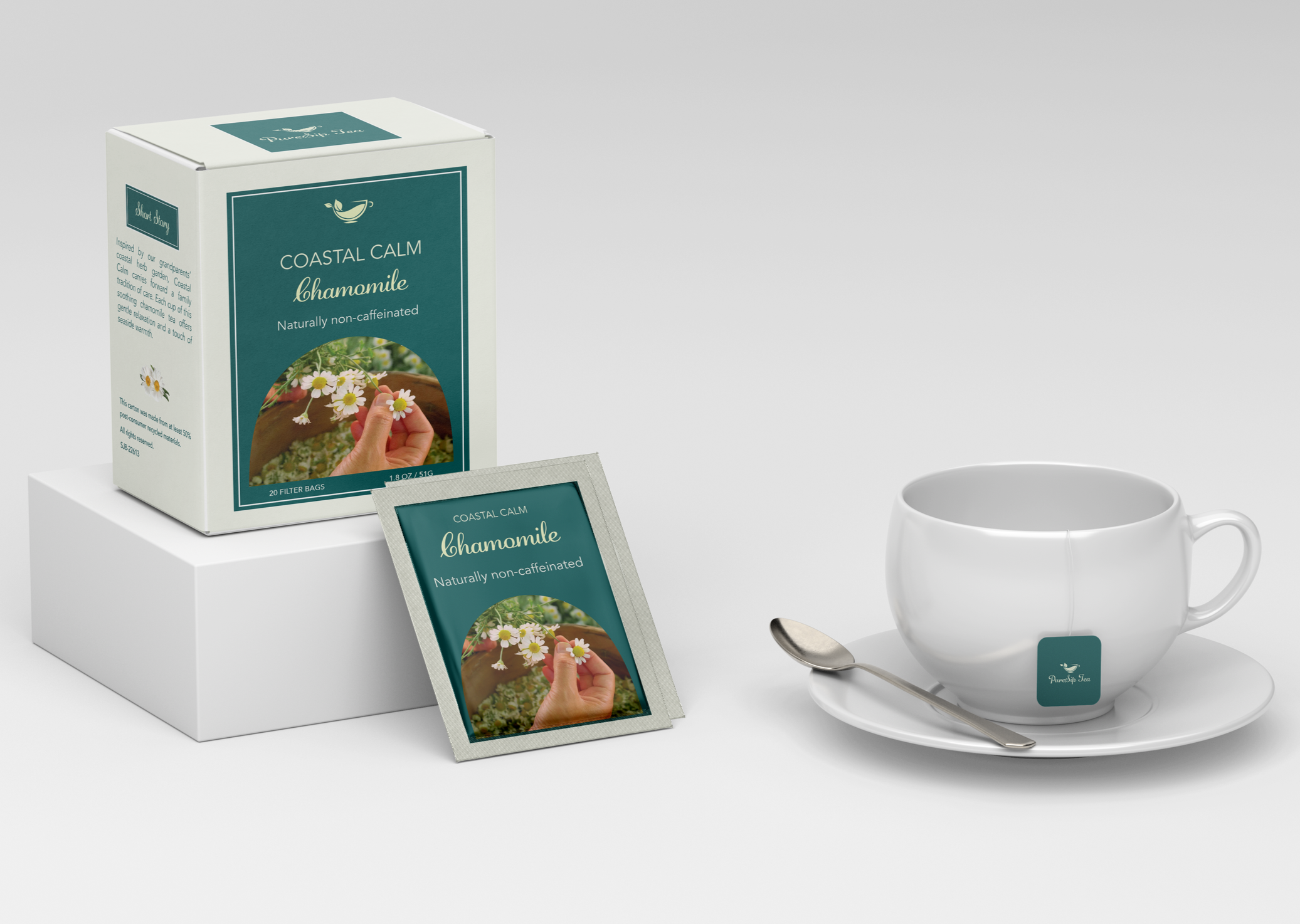
1. Health Conscious
A clean layout, calming color palette, and close-up imagery of the tea to highlight freshness and natural ingredients.
The soft tones and simple typography emphasize relaxation, purity, and a sense of calm, appealing to consumers who choose tea for wellness and self-care.
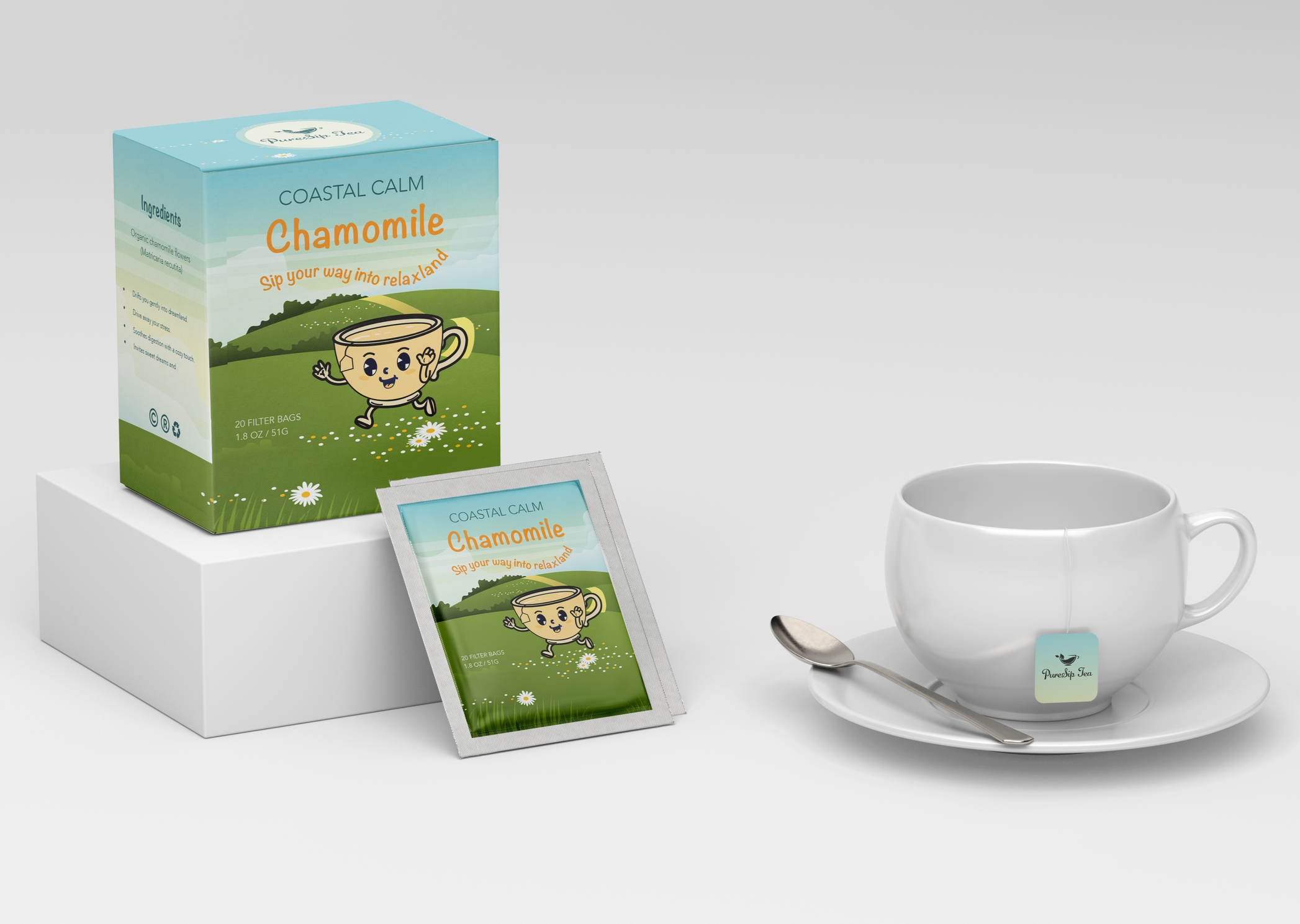
2. Comic / Playful
A clean layout, calming color palette, and close-up imagery of the tea to highlight freshness and natural ingredients.
The soft tones and simple typography emphasize relaxation, purity, and a sense of calm, appealing to consumers who choose tea for wellness and self-care.
A friendly and bright illustrated character, relaxing colors to create an approachable and fun tea identity.
The typeface is intentionally chosen to feel friendly, rounded, and approachable.
The letters have soft curves and gentle stroke transitions, which mimic the organic shape of chamomile petals and rolling hills in the background illustration. This creates a warm, inviting tone that makes the tea feel fun rather than formal.
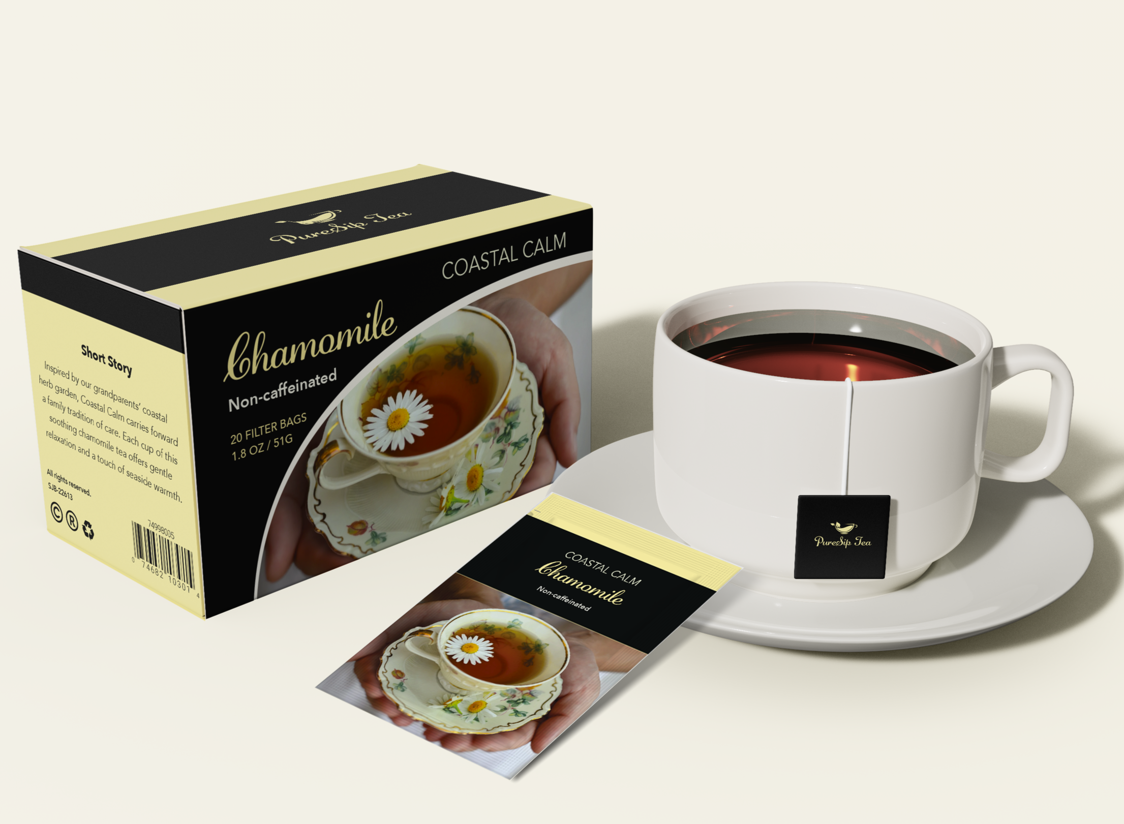
3. Folksy
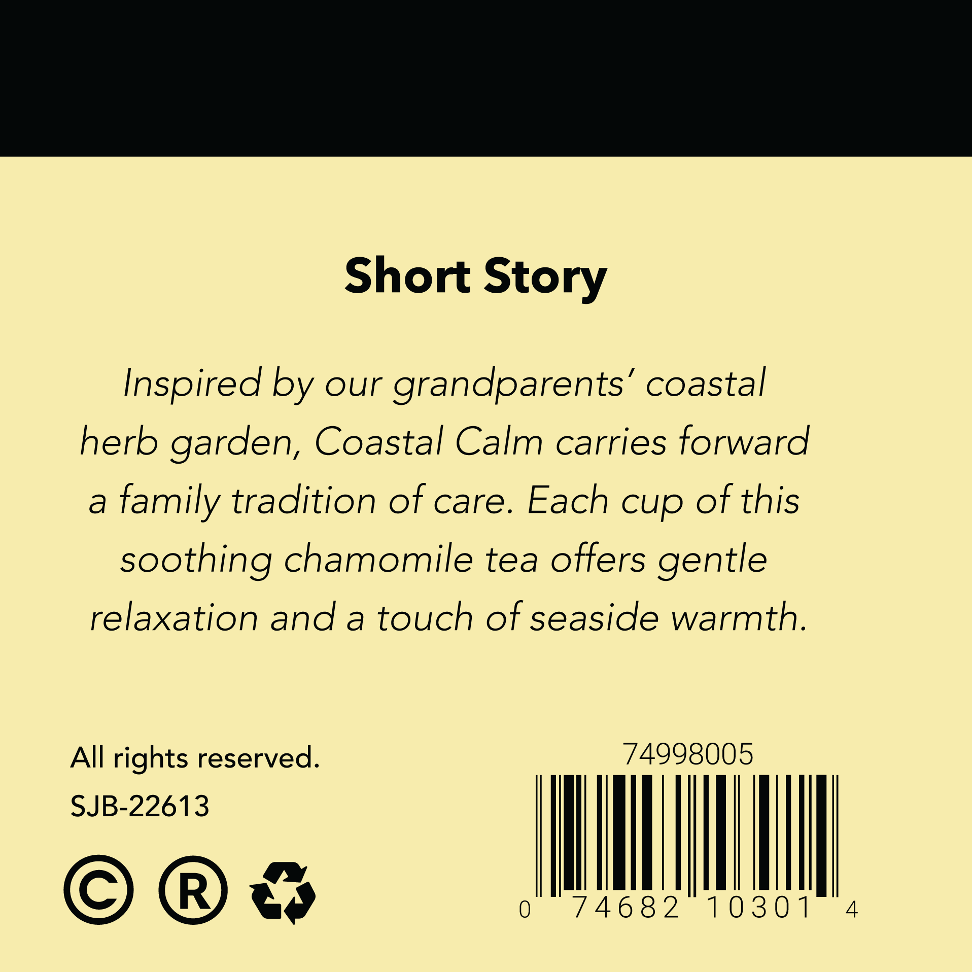
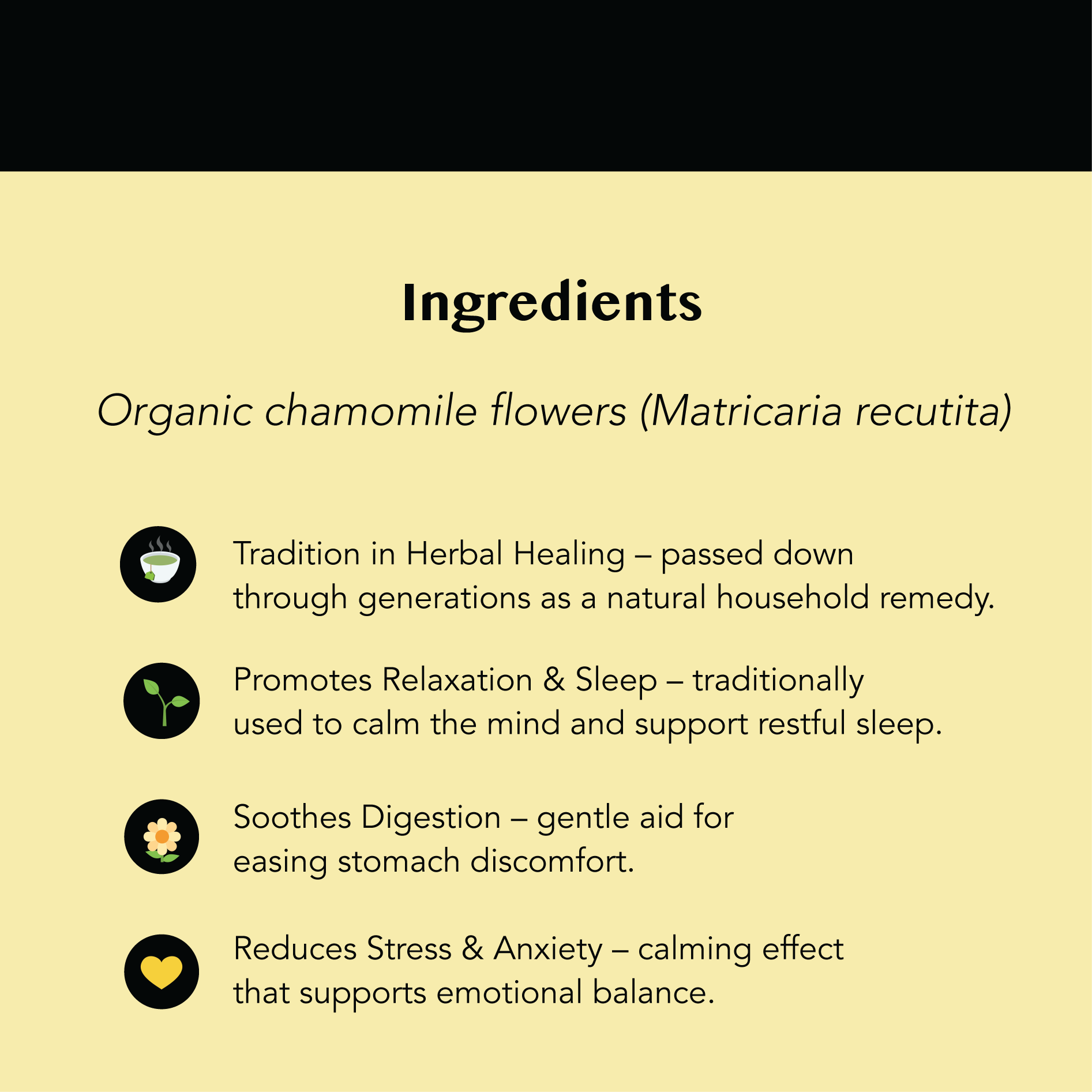
Natural textures and photographic storytelling to evoke warmth, tradition, and community.
The warm yellow conveys feelings of comfort, calm, and natural light, reflecting the soothing qualities of chamomile tea. It suggests freshness, positivity, and a gentle, uplifting mood.
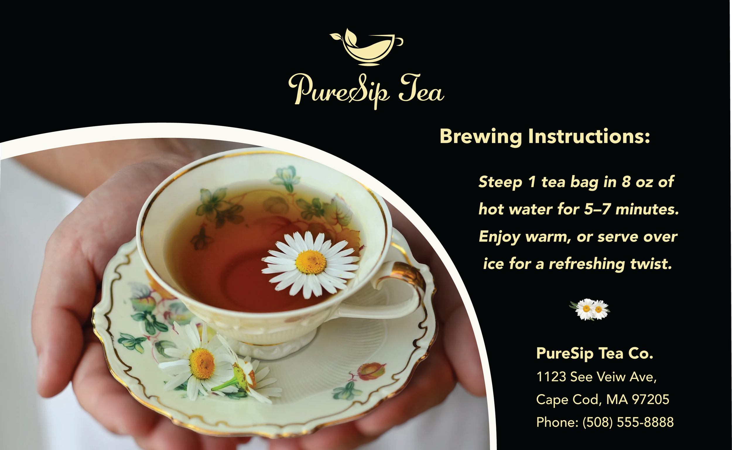
Back side
Left side
Right side